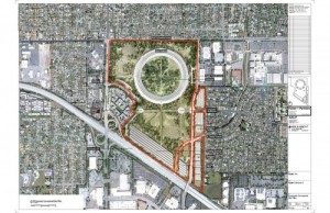
It is disheartening to see that one of the most innovative companies in the world has wasted a great opportunity and is choosing for its new corporate campus the most conventional stereotype of suburban sprawl: a free-standing, single-use, mega-structure in the form of a glass doughnut. We are not talking about architecture here; no doubt the architecture could be spectacular. It will be Foster + Partners designing the building, so we can expect the architecture to be the state of the art. What is hugely disappointing and substandard for Apple is that their place-making concept is wrong. They will create a commuter-oriented environment using one type of building: an object, to which everybody commutes (yes, 2/3 not by car but still commuting). Some may find the spaceship beautiful, free-floating in green space. But that is not the point.
The point is that the Apple campus could have been a real place. Located amidst disconnected fabric of sprawling enclaves, it could have been a focal node in suburban Cupertino. Why not incorporate living, dining, entertainment, shopping, within the campus? This would have been a revolutionary idea, similar to the spectacular Apple products. How about a new elegant product for suburbia – a self-sustained, walkable, human-scale place? An opportunity was missed to correct past mistakes in the way the region grew, to infuse sprawling Cupertino with a piece of real urbanism.
How could this be achieved? The program housed in the corporate mega-structure could be distributed differently: the restaurant facilities, the café, the fitness center, the corporate auditorium, the research facilities could be pulled out of the internalized, air-conditioned mega-space and located along streets, squares and greens, making enjoyable, sociable, intimate environments and public spaces for employees and visitors and taking advantage of the gorgeous California weather. Why would they put 13,000 employees into a huge bubble? Instead of walling off the numerous amenities in a single building, as is typically done in a suburban office enclave, they could be incorporated into an urban fabric to create a lively urban node. Imagine the benefit to those 13,000 employees, and to the city of Cupertino, if those amenities were available in a nice, walkable environment.
The open space as a mega space is also ill conceived, as humans prefer the spectacle of a lively street instead of acres of open space. With security an important issue, the campus could be secured along the perimeter (as the current design suggests) and still be a decent, walkable human environment. The campus will amount to 2.8 million square feet of program – equaling 5% of the total office space in downtown San Francisco – a pretty substantial number that could be distributed into a pedestrian-friendly, human-scale urban fabric of small blocks that would be easy to build, easy to phase, and pleasant to walk around. This is how the human scale, user friendliness, elegance, and simplicity typical of Apple products could have been achieved. Great urbanism integrated with great architecture would have been a perfect fit for Apple’s ambition to create the creative 21-century workplace.
We have become accustomed to seeing the best from Apple. Not this time.
